
From Drab to Fab: 2025’s Hottest Color Palettes for Home Interiors
Home interiors are getting a bold and refreshing makeover in 2025 as color trends evolve to create stylish, inviting, and personalized spaces. This year, home renovation projects are focusing on color palettes that balance sophistication with comfort, making interiors feel more vibrant, cozy, and modern. Whether you’re redesigning a single room or revamping your entire home, the right color choices can transform a dull space into a stunning sanctuary.
In this article, we explore the top color palettes for 2025, the psychology behind each trend, and how to incorporate these colors into your home renovation projects seamlessly.
1. Earthy and Warm Neutrals: The Heart of 2025 Home Design
For years, neutral colors have been the go-to choice for homeowners looking for a timeless and sophisticated aesthetic. However, in 2025, neutrals are evolving beyond the stark whites and cool grays of the past. This year, we’re embracing earthy, warm tones that create a sense of coziness, depth, and natural beauty in home interiors.
Gone are the days of sterile, all-white spaces that feel impersonal. Instead, the latest home renovation trends focus on neutrals with character—shades that evoke warmth, comfort, and an organic connection to nature. Whether you’re remodeling an entire home or simply refreshing a room, these colors offer a versatile foundation for a stylish yet welcoming space.
Trending Colors for 2025: Warm and Inviting
The neutrals of 2025 aren’t just about playing it safe—they are about creating a sense of sanctuary in the home. The following shades are leading the way:
- Warm Taupe – A soft, elegant neutral with a hint of brown, perfect for creating a cozy atmosphere.
- Rich Beige – A classic yet modern alternative to gray, offering warmth and versatility.
- Soft Caramel – A subtle golden hue that adds depth without overwhelming a space.
- Clay and Terracotta – Inspired by natural earthen materials, these hues bring a rustic, Mediterranean feel.
- Muted Olive Green – A blend of earthy green and gray, offering a subtle connection to nature.
Why Earthy Neutrals Work in 2025 Home Design
There’s a reason why these warm, earthy tones are taking center stage in home interiors—they create an environment that feels comfortable, inviting, and effortlessly stylish.
1. A Calming and Grounding Effect
In a fast-paced world, our homes have become our retreats. Earthy neutrals have a naturally calming effect, helping to create a peaceful ambiance that promotes relaxation. Unlike stark whites, which can sometimes feel cold, these hues wrap a space in warmth, making it feel lived-in and inviting.
2. A Perfect Canvas for Layering
One of the biggest advantages of warm neutrals is their versatility. They serve as the perfect backdrop for layering textures, patterns, and accent colors. Whether you prefer a minimalistic design or a more eclectic aesthetic, these colors can be paired with bold elements like deep blues, burnt oranges, or dark wood tones to create a balanced and visually interesting space.
3. A Timeless Choice with Modern Appeal
Trendy colors come and go, but warm neutrals have lasting appeal. They provide a timeless foundation that can be updated over the years with small decor changes. Whether you love modern, rustic, or Scandinavian-inspired interiors, these hues adapt seamlessly to different styles.
How to Use Earthy Neutrals in Home Renovation
Incorporating earthy and warm neutrals into your home doesn’t require a complete overhaul. Simple updates can instantly refresh your space while keeping things cozy and stylish. Here are some practical ways to introduce these hues into your home renovation:
1. Transform Your Walls with Warm-Toned Paint
Painting your walls is one of the most effective ways to change the mood of a room. Swapping out cool grays or stark whites for a warm taupe, beige, or soft caramel instantly makes a space feel more welcoming. These tones work beautifully in living rooms, bedrooms, and even kitchens.
➡️ Pro Tip: Opt for matte or eggshell finishes to enhance the cozy effect.
2. Elevate Your Kitchen and Bathroom with Terracotta Tiles
Terracotta and clay tiles are making a huge comeback in 2025, adding a touch of Mediterranean charm to modern interiors. These tiles work wonderfully as backsplashes, flooring, or even fireplace surrounds, bringing warmth and character to your home.
➡️ Pro Tip: Pair terracotta tiles with brass or matte black fixtures for a stunning, contemporary contrast.
3. Layer Natural Textures for Depth and Interest
To make your space feel even more inviting, complement warm neutrals with natural materials like wood, linen, rattan, and jute. This layering effect prevents the space from feeling flat and instead adds a rich, organic feel.
➡️ Pro Tip: Use wooden furniture, woven baskets, linen curtains, and wool throws to create a well-balanced interior.
4. Introduce Muted Olive Green for a Subtle Pop of Color
If you love a neutral base but want a hint of color, muted olive green is the perfect choice. This shade blends beautifully with beige, taupe, and caramel tones while bringing an earthy freshness to the space.
➡️ Pro Tip: Try using olive green kitchen cabinets, upholstered chairs, or accent walls to add depth without overwhelming the room.
5. Warm Up Your Space with Soft Lighting
Lighting plays a crucial role in enhancing the warmth of earthy neutrals. Instead of harsh white lighting, opt for warm, dimmable LED bulbs, table lamps with fabric shades, and pendant lights with gold or brass finishes to create a soft, ambient glow.
➡️ Pro Tip: Add candles and soft fairy lights for an extra touch of coziness.
Why You Should Embrace Warm Neutrals in 2025
If you’re planning a home renovation in 2025, consider embracing earthy and warm neutrals to transform your space into a modern yet cozy retreat. These colors strike the perfect balance between timeless sophistication and contemporary warmth, making them a versatile and lasting choice for any home.
Whether you’re painting your walls, upgrading your kitchen, or simply adding earthy-toned decor, these shades will help you create a home that feels welcoming, stylish, and effortlessly elegant.
So, if you’re looking to refresh your space from drab to fab, warm neutrals are the way to go!
2. Moody and Dark Hues: Adding Drama and Elegance to 2025 Home Interiors
For years, light and airy color palettes dominated home interiors, creating open and breezy spaces. But in 2025, a bolder, more dramatic aesthetic is taking center stage. Deep, moody hues are transforming interiors, bringing a sense of luxury, coziness, and sophistication to modern homes.
While dark colors were once considered risky or overwhelming, today’s designers and homeowners are embracing them to create rich, inviting atmospheres that feel both modern and timeless. Whether used on walls, cabinetry, or furniture, these colors add depth and personality, making every room feel intentional and well-curated.
Trending Moody Colors for 2025
Dark colors don’t just make a statement—they set a mood. Whether you want a cozy retreat or a sleek, high-end space, these trending hues are dominating home renovation projects in 2025:
- Charcoal Gray – A sophisticated, almost-black hue that adds depth without feeling stark.
- Midnight Blue – A deep, rich blue that exudes elegance and pairs beautifully with metallic finishes.
- Forest Green – A lush, earthy green that creates a grounding, nature-inspired atmosphere.
- Deep Aubergine – A bold, moody purple that adds a touch of opulence and drama.
- Espresso Brown – A warm, deep brown that enhances the richness of wood tones and soft textiles.
Why Moody and Dark Hues Work in Home Design
Dark colors are more than just a trend—they offer a timeless, luxurious feel that elevates any space. Here’s why they are the perfect choice for 2025 home renovations:
1. They Create a Cozy, Intimate Atmosphere
While light colors open up a space, dark tones do the opposite—they envelop a room in warmth and comfort. This makes them an excellent choice for bedrooms, living rooms, and dining areas, where you want a more inviting and intimate feel.
➡️ Pro Tip: Layer dark hues with plush fabrics like velvet, wool, and linen to enhance the cozy effect.
2. They Add a Sense of Luxury and Elegance
Nothing says sophistication quite like deep, rich colors. Shades like midnight blue and deep aubergine bring a high-end, designer feel to any space, whether used on walls, cabinetry, or furniture.
➡️ Pro Tip: Pair dark tones with gold or brass accents for a chic, upscale look.
3. They Make a Bold, Artistic Statement
For homeowners who love a bold aesthetic, moody hues are the perfect way to infuse personality into a space. These colors stand out without being overly flashy, making rooms feel curated and thoughtfully designed.
➡️ Pro Tip: Balance dark walls with artwork, textured rugs, and statement furniture to enhance the visual interest.
4. They Work Beautifully with Natural Light
Dark colors absorb light rather than reflect it, making them ideal for rooms with large windows and plenty of natural sunlight. They add contrast and depth, making a space feel dramatic yet airy.
➡️ Pro Tip: If you have a small, dimly lit room, use strategic lighting and mirrors to prevent the space from feeling too enclosed.
How to Use Moody and Dark Hues in Home Renovation
Dark colors don’t have to mean an entirely black room. There are plenty of creative ways to incorporate these shades into your home without overwhelming the space. Here’s how to do it right:
1. Create a Dramatic Accent Wall
If you’re hesitant to go all-in with dark colors, an accent wall is the perfect starting point. A midnight blue or forest green accent wall instantly adds depth and contrast without making the room feel too dark.
➡️ Pro Tip: Choose a wall that gets plenty of natural light to prevent the space from feeling closed in.
2. Upgrade Your Kitchen with Dark Cabinets
Dark kitchen cabinets are one of the biggest home renovation trends of 2025. Charcoal gray, espresso brown, and deep green cabinets create a sleek, high-end look that pairs beautifully with marble countertops and metallic hardware.
➡️ Pro Tip: Use under-cabinet lighting to highlight the richness of dark cabinetry and keep the kitchen feeling bright.
3. Make a Statement with Moody Bathrooms
Dark bathrooms are unexpected yet incredibly stylish. A deep aubergine or charcoal gray bathroom creates a spa-like retreat with a modern, luxurious edge.
➡️ Pro Tip: Pair dark walls with white or gold fixtures to keep the space feeling elegant and well-balanced.
4. Layer Dark Tones with Lush Textiles
To make a dark-colored room feel inviting rather than heavy, focus on layering textures. Use plush velvet pillows, soft wool rugs, and linen curtains to create a rich, multi-dimensional look.
➡️ Pro Tip: Add pops of lighter colors (like cream or blush) in your textiles for contrast.
5. Use Reflective Surfaces to Balance Darkness
To prevent a dark room from feeling too heavy, incorporate reflective elements like mirrors, metallic accents, and glossy finishes. These details help bounce light around the space and add a sense of openness.
➡️ Pro Tip: A large gold-framed mirror or glass coffee table can instantly brighten up a moody room.
Why You Should Embrace Dark Colors in 2025
Dark colors are bold, sophisticated, and timeless, making them one of the most exciting trends in home renovation for 2025. Whether you’re adding a moody accent wall, upgrading your kitchen cabinets, or transforming your bathroom, these hues bring depth, drama, and elegance to any space.
By pairing dark colors with natural light, plush textures, and metallic accents, you can create a home that feels cozy, modern, and effortlessly stylish. So if you’re ready to move beyond neutrals and embrace a richer, more luxurious aesthetic, moody hues are the perfect choice for your next home makeover.
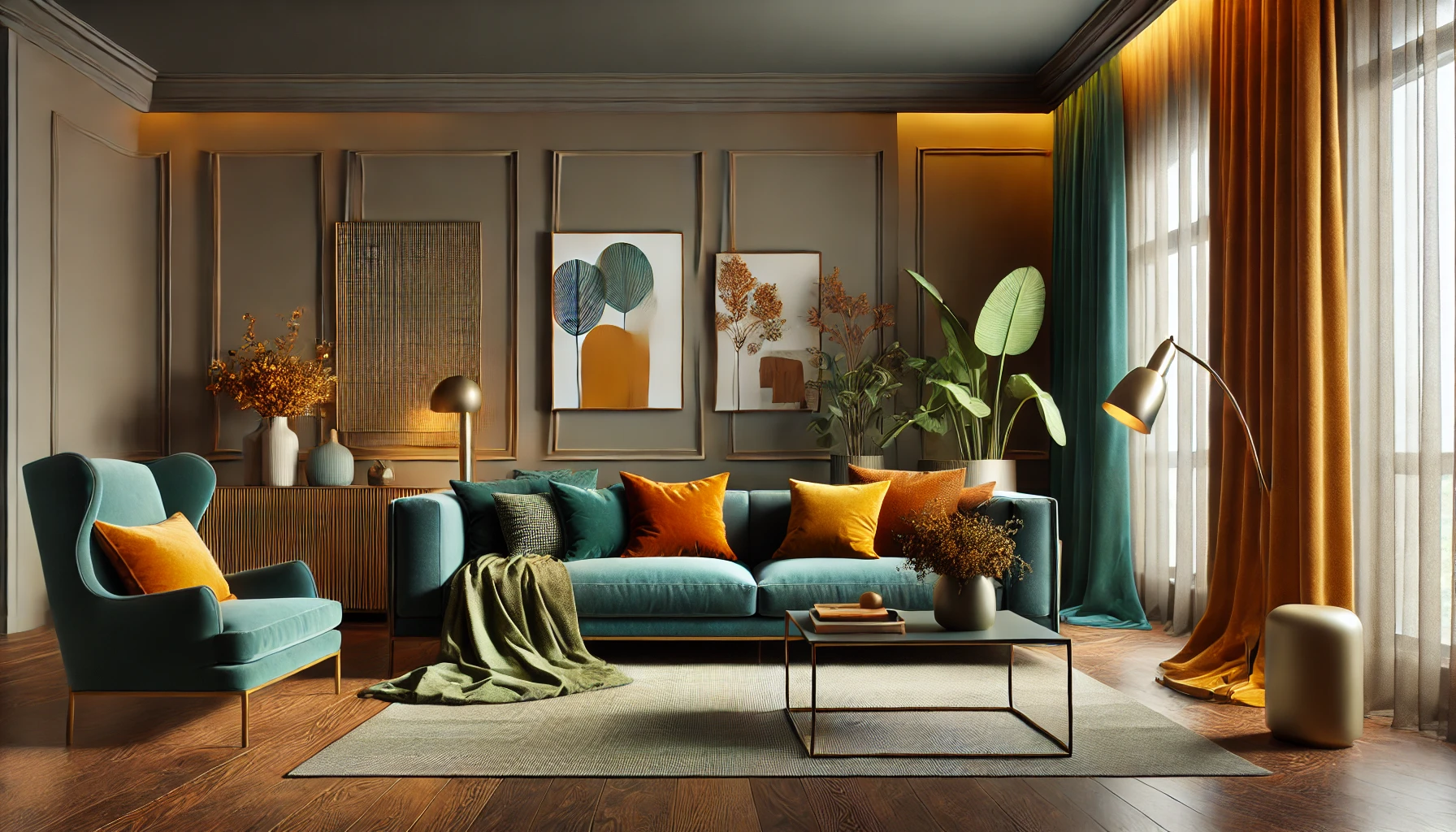
3. Vibrant and Playful Pops of Color: Infusing Energy into Home Interiors
2025 is the year of bold self-expression in home design. While neutrals and moody tones have their place, vibrant colors are making a splash in modern interiors, bringing joy, personality, and a fresh perspective to home renovation. Instead of overwhelming entire rooms, these striking hues are used strategically—in accent walls, furniture, decor, and statement pieces—to liven up spaces without feeling chaotic.
If you love creativity, fun, and a little bit of boldness, this trend is for you. Whether in children’s rooms, home offices, kitchens, or eclectic living spaces, vibrant hues make every corner feel more dynamic and expressive.
Trending Vibrant Colors for 2025
Homeowners are gravitating toward warm, energetic shades that instantly brighten up spaces and add visual interest. Some of the hottest colors include:
- Mustard Yellow – A warm and rich tone that pairs beautifully with neutral backdrops.
- Burnt Orange – A deep, earthy shade that feels both retro and contemporary.
- Cobalt Blue – A bold, electric blue that makes a striking statement.
- Bright Coral – A lively and energetic color perfect for adding warmth and personality.
- Emerald Green – A lush and dramatic shade that brings a sense of freshness and luxury.
Why Vibrant Colors Work in Home Design
1. They Add Personality and Fun
A home should reflect the personality of those who live in it. Vibrant hues are a fantastic way to showcase creativity and individuality, making spaces feel unique and joyful.
➡️ Pro Tip: Introduce playful color combinations—like cobalt blue with mustard yellow or burnt orange with emerald green—to add depth and character to your interiors.
2. They Create a Focal Point Without Overpowering a Space
One of the best things about vibrant colors is that they don’t have to take over a room. Instead, they work best as eye-catching accents that bring balance and energy without being overwhelming.
➡️ Pro Tip: Try a color-blocked accent wall or a bright statement piece, like a bold-colored sofa or a patterned rug, to make the room pop.
3. They Boost Mood and Energy
Studies show that colors influence our emotions. Bright yellows and oranges bring warmth and optimism, while bold blues and greens create a sense of excitement and motivation.
➡️ Pro Tip: Use energizing colors in areas like home offices, creative workspaces, or kitchens where you want to feel inspired.
How to Use Vibrant Colors in Home Renovation
🎨 Paint a front door in bright coral or cobalt blue to create an instant, inviting impression.
🛋️ Add mustard yellow or emerald green accent chairs in a neutral-toned living room for a pop of color.
🍽️ Install a burnt orange backsplash in the kitchen for a trendy and warm aesthetic.
🖼️ Use colorful artwork and patterned decor to tie together vibrant shades in a cohesive way.
4. Soft Pastels and Serene Shades: A Breath of Fresh Air in Home Design
For those who prefer a gentle, calming aesthetic, soft pastels and muted tones are making a strong comeback in 2025. These soothing, airy hues bring an element of tranquility and understated elegance to home interiors, making them a perfect fit for homeowners looking to create a peaceful retreat.
Pastel shades blend seamlessly with both modern and traditional decor, offering a timeless and sophisticated look that never goes out of style. Whether used on walls, furniture, or accessories, these hues evoke a sense of serenity, balance, and effortless beauty.
Trending Soft Pastels and Serene Colors for 2025
Pastel colors are no longer reserved just for nurseries! In 2025, these soft yet stylish hues are being embraced in every room of the home. Some of the most in-demand shades include:
- Dusty Rose – A muted pink that adds a touch of romance and sophistication.
- Soft Lavender – A gentle purple with a dreamy, tranquil effect.
- Powder Blue – A light, airy blue that evokes a sense of calm and clarity.
- Sage Green – A fresh, nature-inspired shade that pairs beautifully with wood and neutral tones.
- Pale Peach – A subtle, warm pastel that adds softness without feeling too sweet.
Why Pastel Colors Work in Home Design
1. They Make Spaces Feel Relaxing and Airy
Soft pastel hues bring a sense of lightness and openness, making rooms feel more spacious and serene. This is particularly beneficial for smaller homes or apartments, where lighter shades can enhance the feeling of space.
➡️ Pro Tip: Pair pastel walls with sheer curtains and natural materials like light wood or linen for an effortlessly breezy look.
2. They Complement Both Traditional and Modern Styles
Unlike bold, trendy colors that come and go, pastels have a timeless quality that suits any design aesthetic. Whether your home leans toward minimalist, bohemian, or classic elegance, pastel hues can be seamlessly integrated.
➡️ Pro Tip: Mix pastels with warm neutrals (like beige and soft white) for a harmonious, layered look.
3. They Enhance Natural Light
Pastels reflect light beautifully, making a room feel brighter and more inviting. If your home doesn’t get a lot of natural sunlight, soft pastels can help amplify whatever light is available.
➡️ Pro Tip: Use mirrors and glossy finishes to enhance the reflective properties of pastels.
How to Use Soft Pastels in Home Renovation
🛏️ Paint bedroom walls in soft lavender or sage green for a tranquil, spa-like retreat.
🛋️ Add powder blue or dusty rose throw pillows, curtains, and rugs to bring a gentle touch of color to neutral spaces.
🍽️ Use pastel kitchen cabinetry in pale peach or powder blue for a unique, vintage-inspired aesthetic.
🖼️ Incorporate pastel wall art and ceramics to subtly introduce color into a modern minimalist home
Choosing the Right Color Trend for Your Home
Whether you’re drawn to the bold energy of vibrant hues or the gentle charm of soft pastels, 2025’s home renovation trends offer something for every style. Bright, playful colors bring fun, creativity, and a lively atmosphere, while pastel shades offer a calming, sophisticated retreat.
The key to using color successfully in your home is balance—whether through strategic pops of vibrancy or soft, layered pastels. So, whether you’re refreshing your living room, updating your kitchen, or redesigning a bedroom, let color be your guide in creating a home that truly reflects your personality and lifestyle.
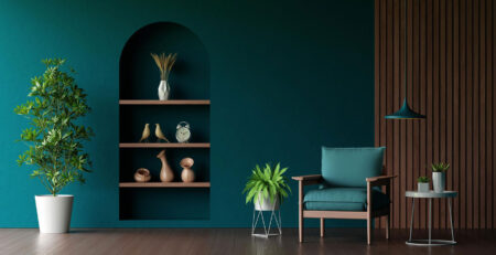
5. Nature-Inspired Greens and Blues: Bringing the Outdoors In
As sustainability and biophilic design gain traction in 2025, home renovation trends are shifting toward colors that reflect the beauty and tranquility of nature. Homeowners are increasingly drawn to earthy greens and calming blues, creating spaces that feel grounded, fresh, and rejuvenating. These shades not only enhance aesthetics but also contribute to a sense of well-being, making them a top choice for modern interiors.
Incorporating nature-inspired hues into home design is more than just a style choice—it’s a way to foster a stronger connection to the natural world, even in urban settings. By blending organic colors with natural materials like wood, stone, and bamboo, homeowners can create peaceful, restorative environments that promote relaxation and balance.
Trending Nature-Inspired Colors for 2025
This year, nature-inspired tones are moving beyond the classic greens and blues to include deeper, richer variations that add depth and sophistication. Some of the most popular shades include:
- Deep Teal – A sophisticated blend of blue and green that exudes calmness and luxury.
- Olive Green – A muted, earthy green that pairs beautifully with neutral tones and wood accents.
- Ocean Blue – A deep, rich blue that captures the essence of open water and endless skies.
- Moss Green – A soft, forest-inspired shade that brings an organic feel to interiors.
- Sky Blue – A light, airy shade that evokes a sense of openness and serenity.
Why Nature-Inspired Colors Work in Home Design
1. They Promote Relaxation and Well-Being
Green and blue are inherently calming colors, often linked to nature, water, and fresh air. Studies show that being surrounded by natural hues can reduce stress, increase productivity, and improve overall mood.
➡️ Pro Tip: Use moss green or ocean blue in bedrooms and living areas to create a tranquil atmosphere that encourages relaxation.
2. They Work Well with Organic and Sustainable Materials
Nature-inspired colors pair beautifully with wood, stone, rattan, bamboo, and linen, enhancing the overall aesthetic of a space. These combinations make a home feel organic, timeless, and effortlessly stylish.
➡️ Pro Tip: Try olive green cabinetry with brass hardware and light wood countertops for a fresh, eco-friendly kitchen design.
3. They Offer Versatility in Design
Unlike ultra-bold colors that may feel overpowering, greens and blues are highly adaptable. They work well in both modern and traditional homes and can be used for walls, furniture, and decor accents without overwhelming a space.
➡️ Pro Tip: Pair deep teal walls with white or beige furnishings for a balanced and sophisticated look.
4. They Bring a Connection to the Outdoors
With the rise of indoor plants and biophilic design, greens and blues naturally complement lush greenery, large windows, and open spaces, making homes feel more connected to nature.
➡️ Pro Tip: If you love the coastal aesthetic, mix sky blue with sandy beige, driftwood, and woven textures for a light, breezy feel.
How to Use Nature-Inspired Colors in Home Renovation
🌿 Create a Feature Wall in Moss Green or Deep Teal
A single accent wall in a rich, nature-inspired hue can completely transform a room. In living rooms and bedrooms, a moss green or deep teal wall adds depth and coziness, especially when paired with neutral furniture and soft lighting.
🛁 Incorporate Ocean Blue in Bathroom Tiles or Vanities
Blue tones work particularly well in bathrooms, bringing a spa-like, refreshing feel. Whether through subway tiles, painted vanities, or decorative accents, adding ocean blue creates a serene retreat.
🍽️ Use Olive Green or Teal in Kitchen Cabinetry
Rich greens and blues are replacing traditional white cabinets in 2025. Olive green and deep teal add warmth and character to kitchens, especially when paired with gold hardware, butcher block countertops, or marble backsplashes.
🖼️ Decorate with Nature-Inspired Artwork and Textiles
If painting walls in bold colors feels like too big of a commitment, introduce these hues through throw pillows, rugs, curtains, or framed botanical prints. This approach allows for easy updates while still embracing the trend.
🏡 Pair with Natural Elements for a Cohesive Look
To enhance the organic feel, combine these colors with indoor plants, natural wood furniture, and woven textures. Adding large leafy plants, bamboo light fixtures, and linen drapes will elevate the earthy, nature-inspired ambiance.
Embracing Nature Through Color
In 2025, home renovation is all about bringing nature indoors, and using greens and blues is a simple yet impactful way to achieve this. Whether through deep teal walls, olive green cabinets, or sky-blue textiles, these hues offer a perfect balance of relaxation, sophistication, and timeless appeal.
By incorporating natural materials, warm neutrals, and plenty of greenery, homeowners can create peaceful, welcoming spaces that feel harmonious with the world outside. So, whether you’re updating a single room or embarking on a full home renovation, let the colors of nature guide your design choices for a home that feels both grounded and revitalizing.
Conclusion
2025’s home renovation trends are all about color choices that transform interiors from drab to fab. Whether you prefer warm neutrals, moody hues, bold pops of color, or nature-inspired shades, this year’s color palettes offer something for everyone.
By thoughtfully integrating these trending colors into your home, you can create a stylish, inviting, and modern space that reflects your personality and enhances your living environment. So, whether you’re repainting walls, updating furniture, or completely remodeling home, embrace the power of color to make your home truly shine.


Leave a Reply